Tldr: PPA! 2.0 is the second version of my first pomodoro timer app that utilizes gamification to encourage productivity! Click on the demo on the right before delving into the whole process below!
PERSONAL PRODUCTIVE ASSISTANT! 2.0
Time: Version 1.0 [October 2018 - November 2018], Version 2.0 [March 2020]
My Role: Sole Contributor
Skills: Secondary Research, Competitive Analysis, Prototyping, User Flow, Usability Testing
Tools: Illustrator, XD
Overview
As someone who persistently find ways to improve, I revisited my old app - Personal Productive Assistant. Be sure to check my first rendition for more in-depth methods as I build on 2.0. This app used a mascot heavily inspired by a Disney icon in order to improve work productivity at home. Hence the meaning of the initials PPA! as your Personal Productive Assistant! While this app is dear to my heart for being one of my first product design projects - it also lacked in a lot of areas.
Limitations of PPA! 1.0:
Had too of a narrow solution to apply for a wide-range audience (i.e. trying to save money on top of staying at home on top of staying focused)
Information architecture (awkwardness when it comes to navigation and overall flow)
Objectives
As a result, I revamped PPA! into a pomodoro timer app that utilizes winning game tokens as motivation. I released the restrictions of environment of the subject and focused more of the gamification element that I initially wanted to shine. I desired for this app to be accessible, adjustable, and accountable.
“An app that transforms our distractions into convictions.”
In addition, I wanted to set a metric for success in this product. My goal is to manifest customer loyalty so at the end of the usability testing, I hope to see positive results in the emotions and advocacy the users will have towards this product. These metrics is key in how satisfactory PPA actually is.
Reframing the Problem Statement & Target Audience
Because this version is quite different than our predecessor, I went back to the drawing board and reframed the question from, “How might we increase work productivity at home?” to
How can we motivate ourselves to stay focus?
Yes, this question is broader, but this allows the app to be versatile and adjustable and accessible to anyone who may need it.
The target audience is aimed towards younger adults, preferably high school/college students. The gamification appeals to a younger demographics, while education platforms demands the most productivity in a set schedule.
Secondary Research
Based on this article that explores the history of gacha games, we see a feature that it utilizes is partial reinforcement. To familiarize, gacha games highlight that randomization of reward is the core of the game*. It’s partial reinforcement, which is a subset of operant conditioning as initially seen in the Skinner Box, is keeps the users going. In addition, having that availability heuristic of seeing your friends online achieving their awards can help serve as an incentive for users to keep playing. It’s addicting, and if I can implement that addiction to a time management app - I have hopes in conforming unhealthy habits into healthy behavior.
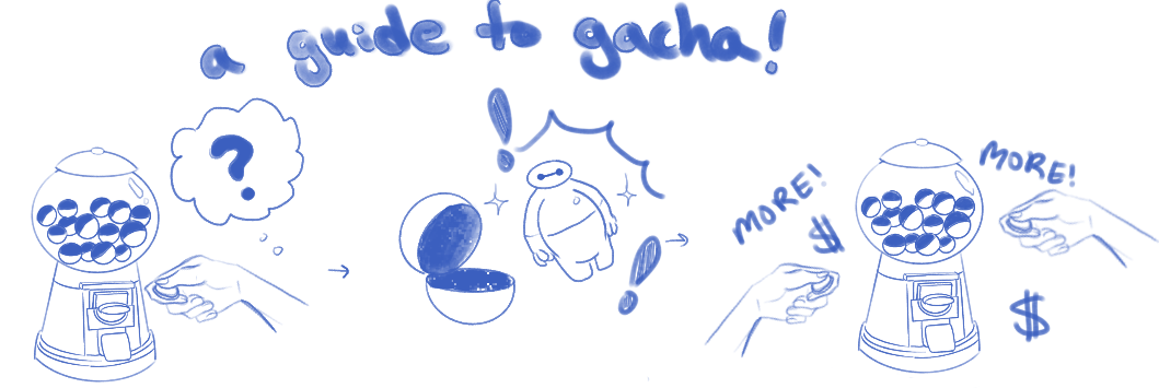
*The best way to understand the gacha system is imagine a toy machine that dispenses randomized prizes.
1. Insert game coin 2. Receive a randomized prize 3. Get addicted and collect them all!
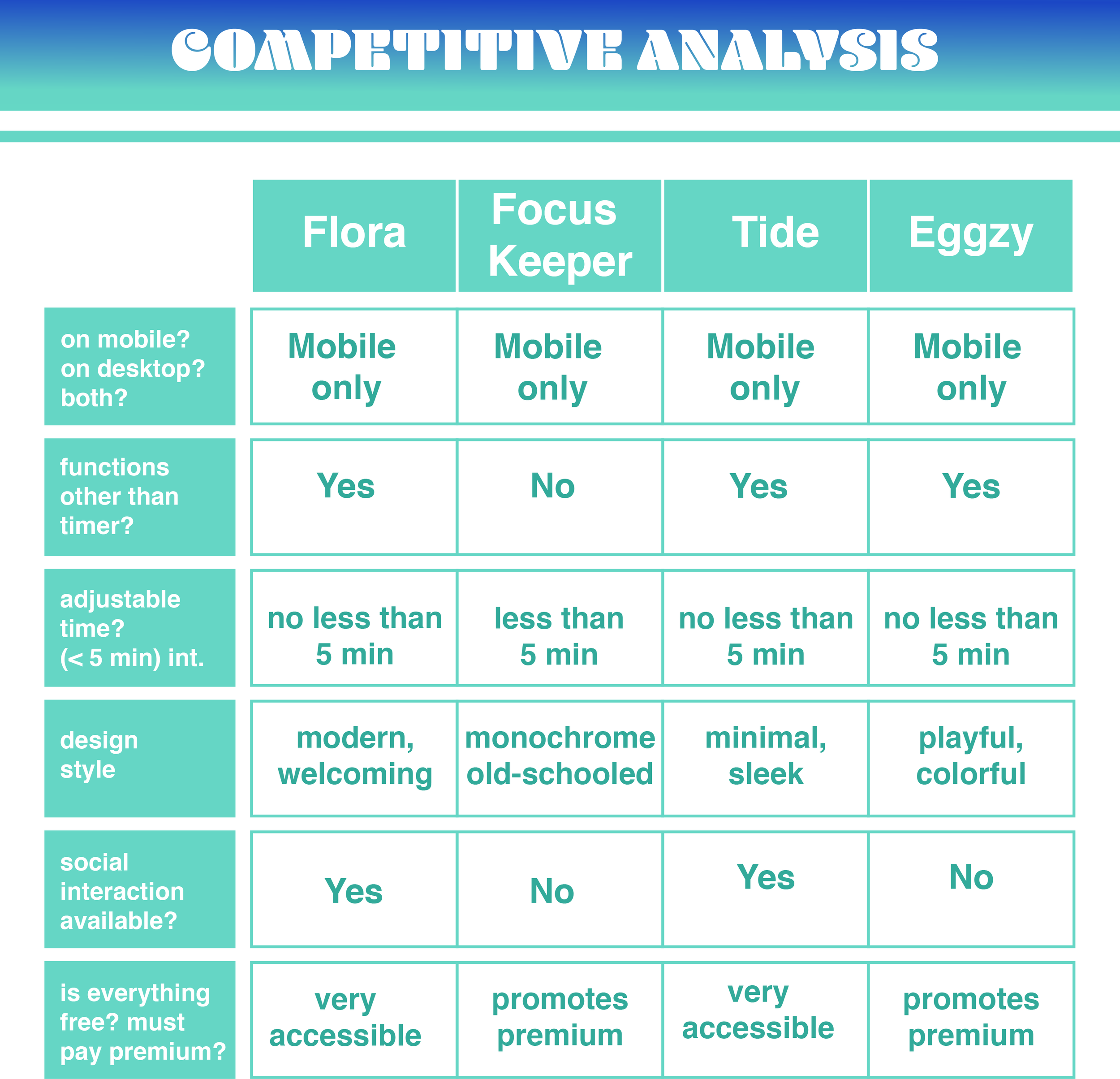
Competitive analysis
For my competitive analysis, I took four time management apps that all had a rating above a 4.5. Flora is arguably the most iconic timer app that surged the movement of managing our time with its mission statement of planting trees. Focus Keeper is a straight forward app that had the second highest number ratings next to Flora - it’s old schooled yet efficient design is what draws the users in. Tide may seem to be the most distinct as it serves itself as a meditation app - but its chic design and adjustable sounds can be learned for pomodoro apps. Lastly, Eggzy aligns with the motives of my idea the most with its gacha like gameplay structure in obtaining adorable avatars to complete the set.
Ideation
I realized there was the difference in upgrading a personal design project versus creating one from scratch. Because this upgrade built on top of the idea of my previous work, I had a clearer vision in how to strengthen my information architecture and navigation flow. Thus, this ideation section serves as upgrading to my second iteration. First, I created wireframes to serve as a skeleton.
Wireframes
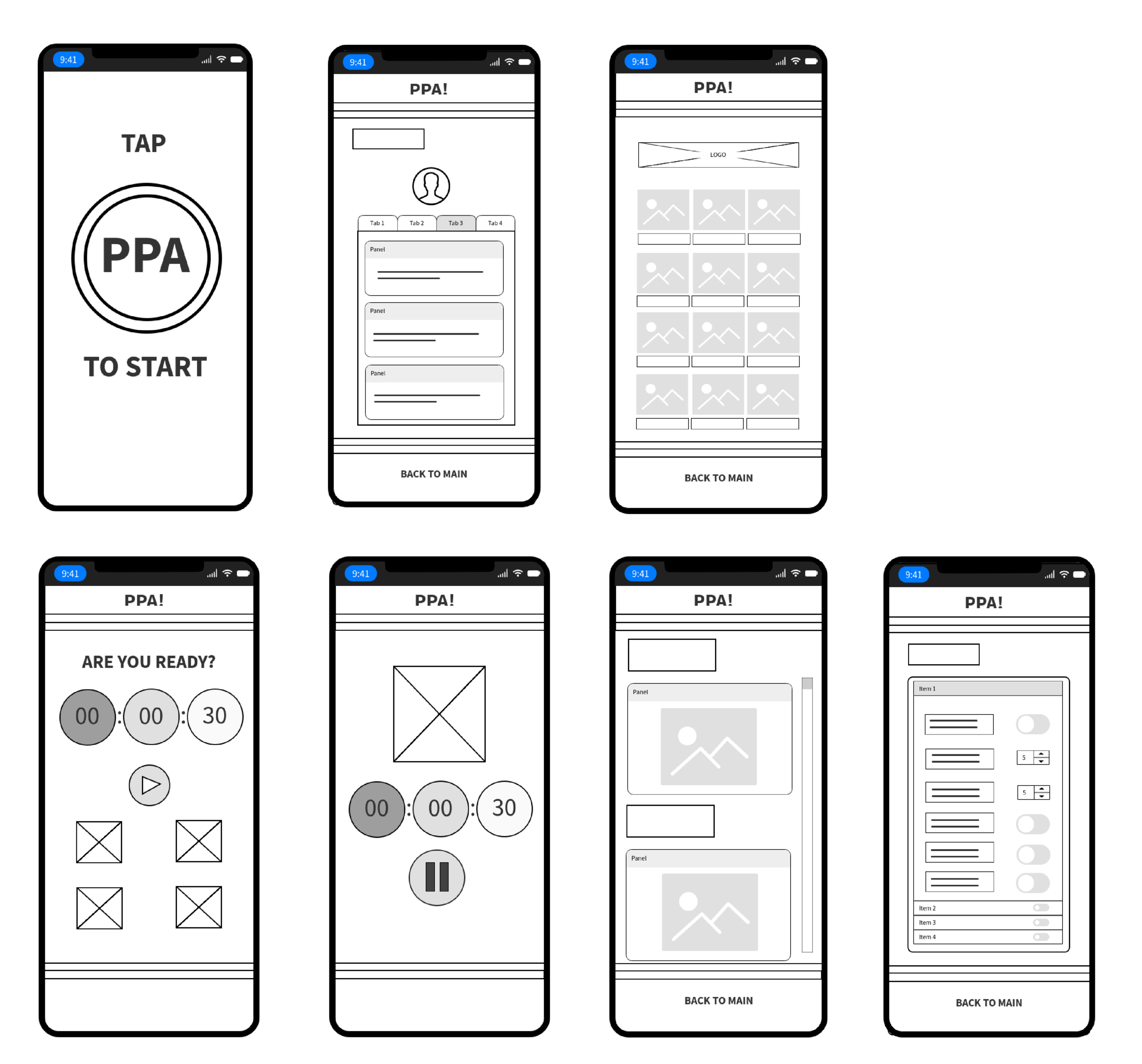
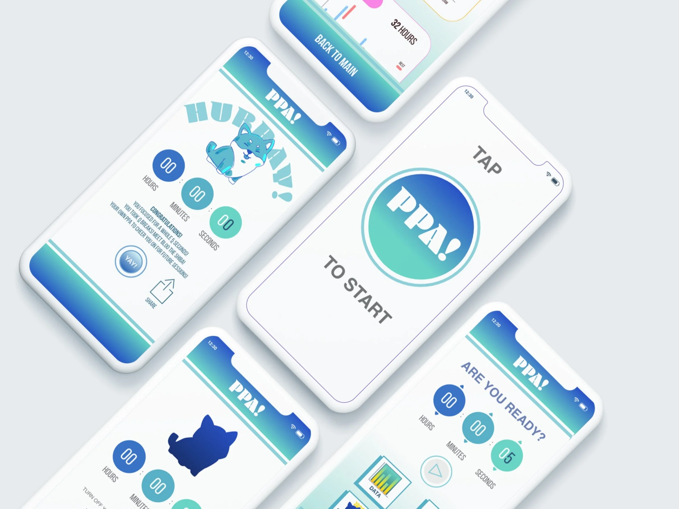
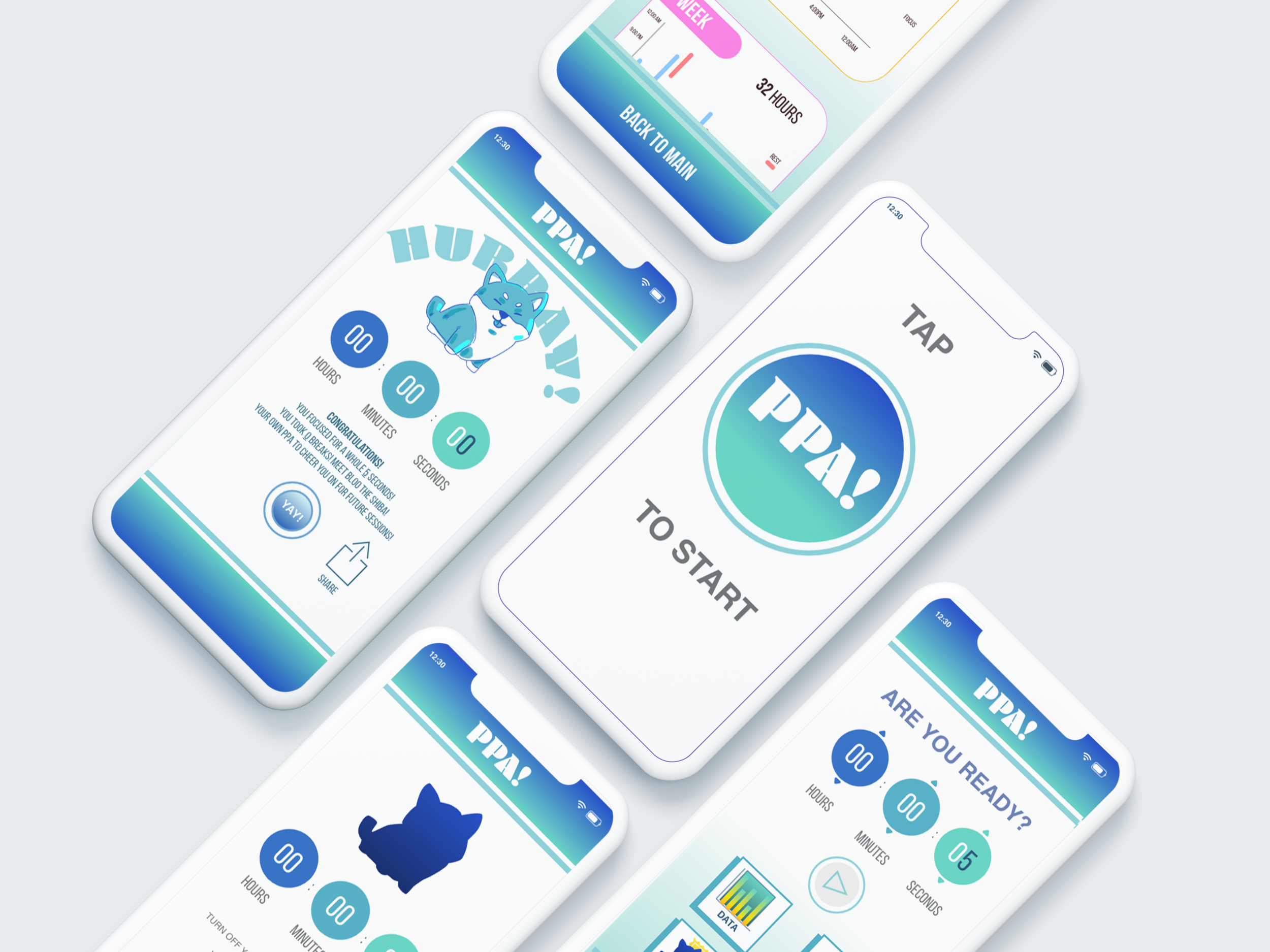
Below is an animation of some of the features I wanted to highlight in the final product:
Key Features
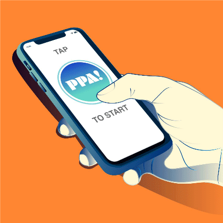
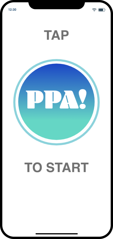
Title Screen
Design Goal: Based on the competitive analysis, it seems that more minimalistic designs appealed to the audience. First impression is everything and I wanted the title screen to be concise and forward.
How might we achieve this? Rebranding PPA! to be a more modern and minimal logo, keeping the gradient aspect from its predecessor
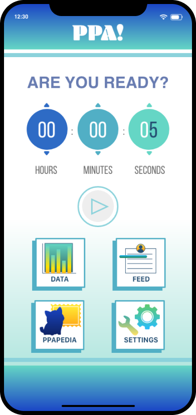
Menu
Design Goal: I wanted to create an all-in-one menu that shows my improvement with navigation by laying out all options, but still highlighting the timer element
How might we achieve this: Create a dashboard! Dashboards are helpful in including all features in an app and it doesn’t feel cluttered since it’s made to include everything.
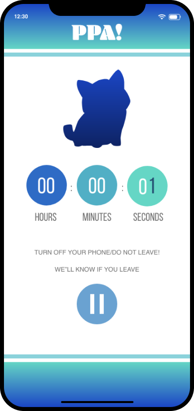
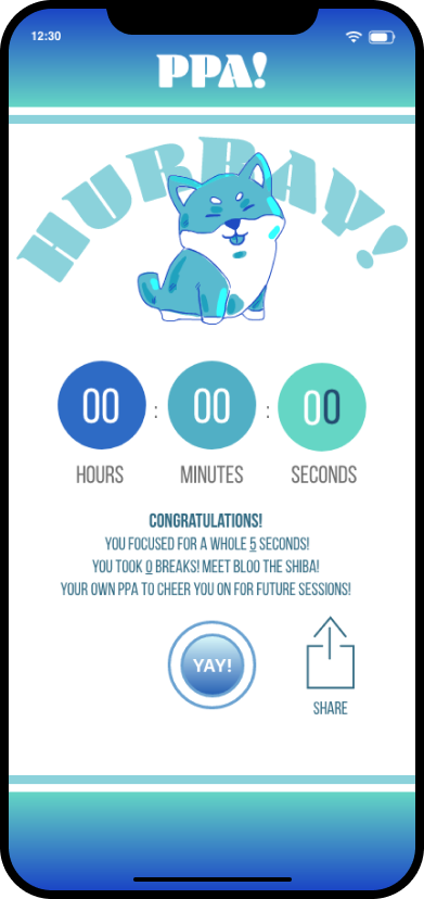
Completed Timer
Design Goal: Design a sleek and modern timer that showcases the adorable avatar you win after successfully completing your session
How might we achieve this: Center the mystery of the icon where the eyes draw to the screen the most, with the timer in a minimal design that has a similar color palette as the app.
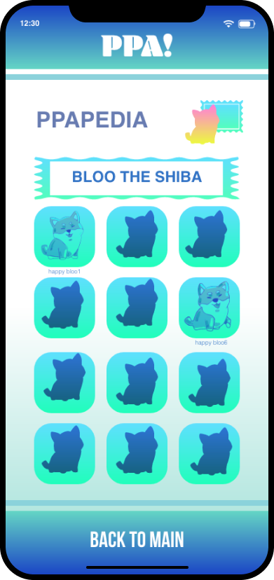
Game Element
Design Goal: Embody the gamification element that’s so addicting to individuals. The user should have an incentive, and should make known of their accomplishments.
How might we achieve this: I created an encyclopedia of the productive assistants (Ppapedia) to instill a nostalgic game collection catalog
Prototyping
With the vision I had in mind, I went on to prototype the newly revamped minimalistic gacha pomodoro timer app: PPA!
User Flow Diagram
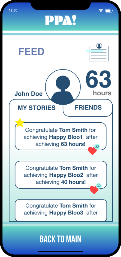
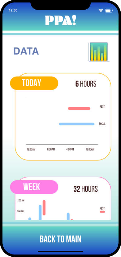
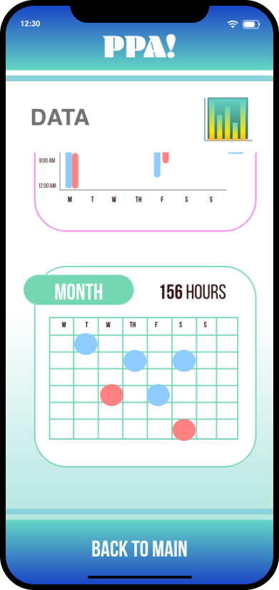
One of my goals was to provide a well balanced navigation menu. Thus, I included both the timer with set-up and four other functions the user can direct themselves to: data to reflect on past statistics, feed to socially interact with friends, ppapedia to incorporate the gacha encyclopedia, and settings. In addition, I provided a pause when the user isn’t ready to finish their time, sending them back to the main menu. However, if they succeed, they are rewarded with a new avatar.
User Testing
Two restrictions shine heavily in my usability testing. One, quarantine prevents an in-person testing which is crucial to see the user’s body movements to actual walkthrough. Two, while social media platforms have allowed me to connect to individuals to test out my app - that pool of people are generally my friends, resulting a biased pool of users. Regardless, I still wanted usability testing on PPA! in order to gain key insights from the users. Being the creator of the app not only causes me to have a biased opinion, but also prevents me from seeing the flaws in the product. The testing functioned where I sent my friend the demo while on video call, and had them screen share their walkthrough of the app. Usability testing is imperative in analyzing the participant’s body language, facial expression, timing of processing, etc. Based on the three friends who graced me with their testing, these are what I discovered:
Visibility Helps: One of the feature that took the users a while to figure out was the time ticks on the timer itself, indicated by a color-coordinated arrow on each bubble. They explained to me that it was too small and that they assumed there would be a screen or pop-up menu dedicated to setting up the time.
How might we fix this? Definitely when it comes to UI, I should increase the visibility by either increasing the size or balancing the design. What I mean by that is if you look at the timer, the size of the arrow is so disportioncate to the bubble. If I could downsize the bubble size or wrap the arrow around to make it more cohesive, it could alert the user more on where to adjust the time.
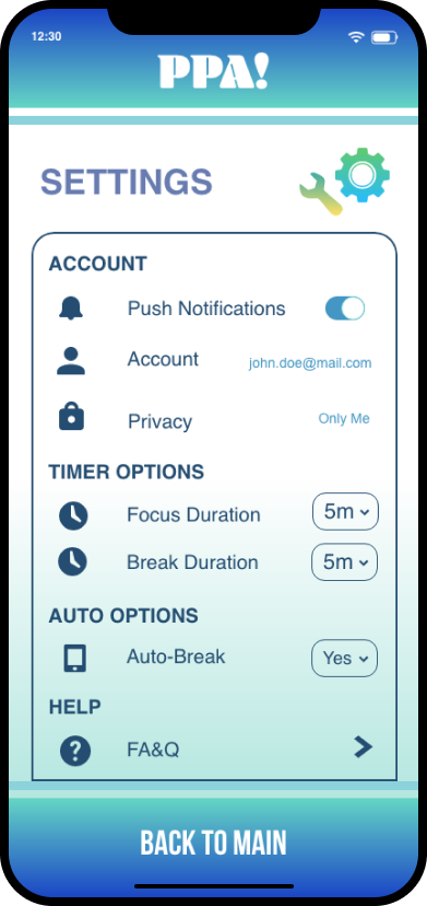
Minimal Presence of Settings: This was interested because on my dashboard, I dedicated a whole tile for ‘Settings.’ However, in all of my runs, my friends spent the least amount of time on the screen or didn’t bother on clicking on it. When I asked them about this, one of them mentions that if an app is designed properly, we don’t need to dedicate a huge surface area of it to settings.
How might we fix this? The Settings screen is albeit the screen I needed the most work on, however I can replace the tile with another feature or opt it out. Then, I would put settings in a default corner that people naturally gravitate towards. Settings these days are hidden with either a slide out menu, and I think for a feature like this - it would be appropriate for proper placement.
How Successful is PPA? & My Final Thoughts
The more I design, the more I realize how imperative the success of a product is. Thus, after the user testing with my three participants, I gave them a survey. The main goal for the user is to continuously use the product. The questions in the survey consisted of, “How happy on a scale from 1-10 are you with the product?” and “Would you recommend this product to a friend?” The results showed an average of 9 in the consumers’ happiness and an unanimous yes in advocacy. I was successful in achieving this but again, addressing my restrictions from user testing - taking it with a grain of salt.
I didn’t expect to revisit a past personal project of mine, but I’m very glad I did for I learned a lot between the gaps of my past self designing vs. present me. In PPA 1.0, I talked about how I noticed my, “obvious areas of improvements such as my organization with the wireframes and the subtle yet imperative presence of UI elements.” I think with this reboot, I’ve made progress in strengthening my weaknesses. Thank you so much for embarking with me on this now 2 year journey. I’ve grown a bit sentimental with this app as it was the first ever app I designed and revisiting it each time really makes me learn something new every time. At the beginning, I wished for this app to be accessible, adjustable, and accountable. I believe with my accessible functions available to the general public, being able to adjust the timer down to the second, and keeping a record of all of our achievements - I was able to meet my objectives.